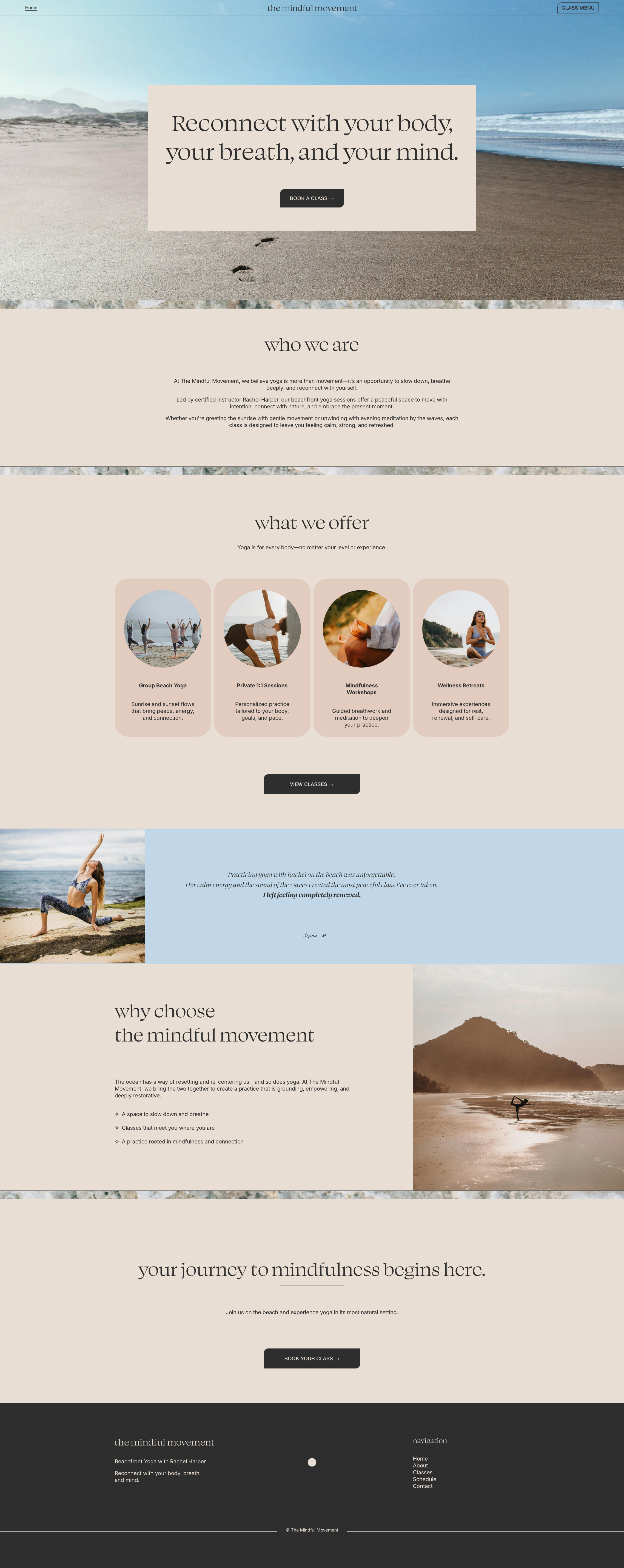
The Mindful Movement
A Concept Project Exploring a More Minimal, Editorial Direction
If you’re curious how I think and decide what goes into a website, here’s an inside look at my decision-making process for a beachfront yoga studio.
The Situation
Rachel built the kind of yoga practice people drive out of their way for, beachfront classes and an atmosphere you can't manufacture. As a result, she developed a loyal following.
She had a website, but it just wasn't doing the work it needed to do. It was functional, but it didn’t make new students feel the instant connection that makes you want to drive out to the beach on a Saturday morning for a yoga class versus sleeping in, and the site didn’t make it easy for them to book once they did.
The Approach
I believe in strategy before design, always.
Before anything was built, I started with one question: what does Rachel's ideal student need to feel before she'll commit to showing up?
That answer shaped everything — the images, the copy, the structure, and the pace of the page.

Three things guided every decision:
One clear path.
Every section moves the visitor toward booking. Nothing else.
Atmosphere before logistics.
People book Rachel because of how her brand feels, not because of her credentials. The site leads with feeling and earns the right to explain later.
Restraint on purpose.
A quiet site is a confident site. Everything on the site was chosen deliberately. Everything else was left out deliberately.
The Design


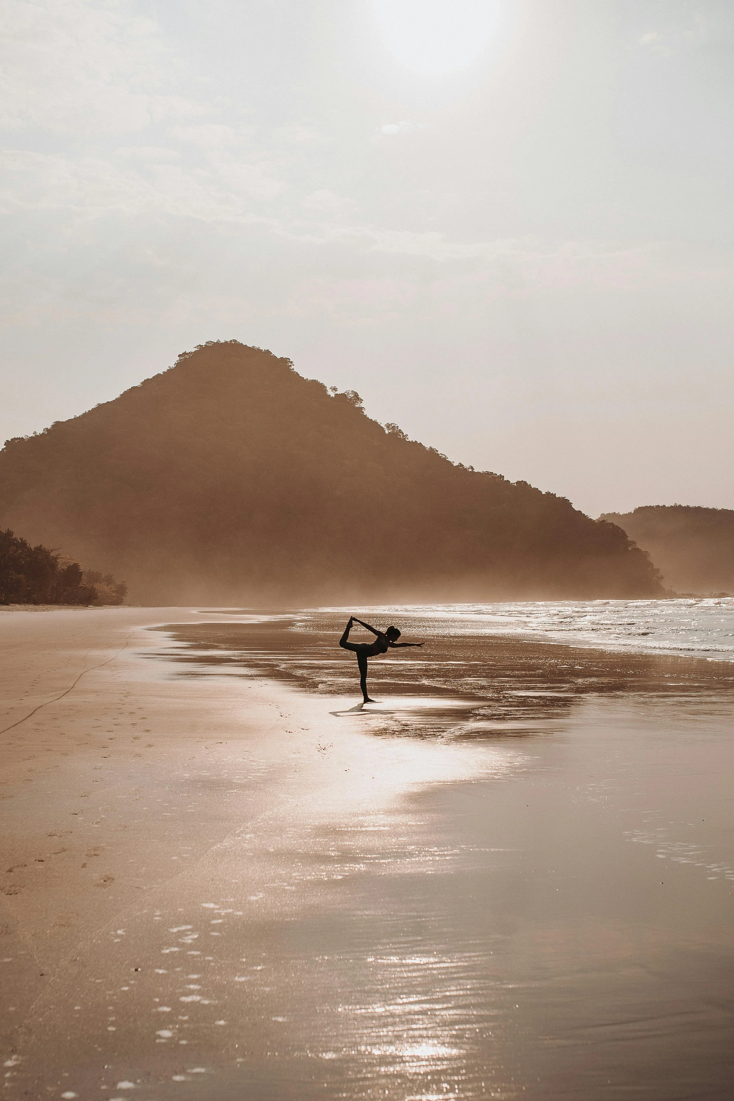
The palette pulls from Rachel's environment — warm sand, open sky, the kind of natural tones that slow your breathing just by looking at them.
The photography does the work. The typography gets out of its way. Sections breathe. The booking button is always within reach without announcing itself.
It feels like stepping onto the beach before class. That was the goal.
The Details
✦ Platform: Squarespace
✦ Project type: Concept
✦ Pages: Home, Classes, About, Schedule, Contact
✦ Focus: Booking conversion, brand alignment, mobile optimization
The Strategy Snapshot
The entire site was built around one goal — getting a visitor to book a class. Every section, every image, and every line of copy exists to move her one step closer to that moment.
“A quiet site is a confident site.
In wellness, restraint isn't a limitation —
it's what makes the work feel “intentional.”
A Closer Look
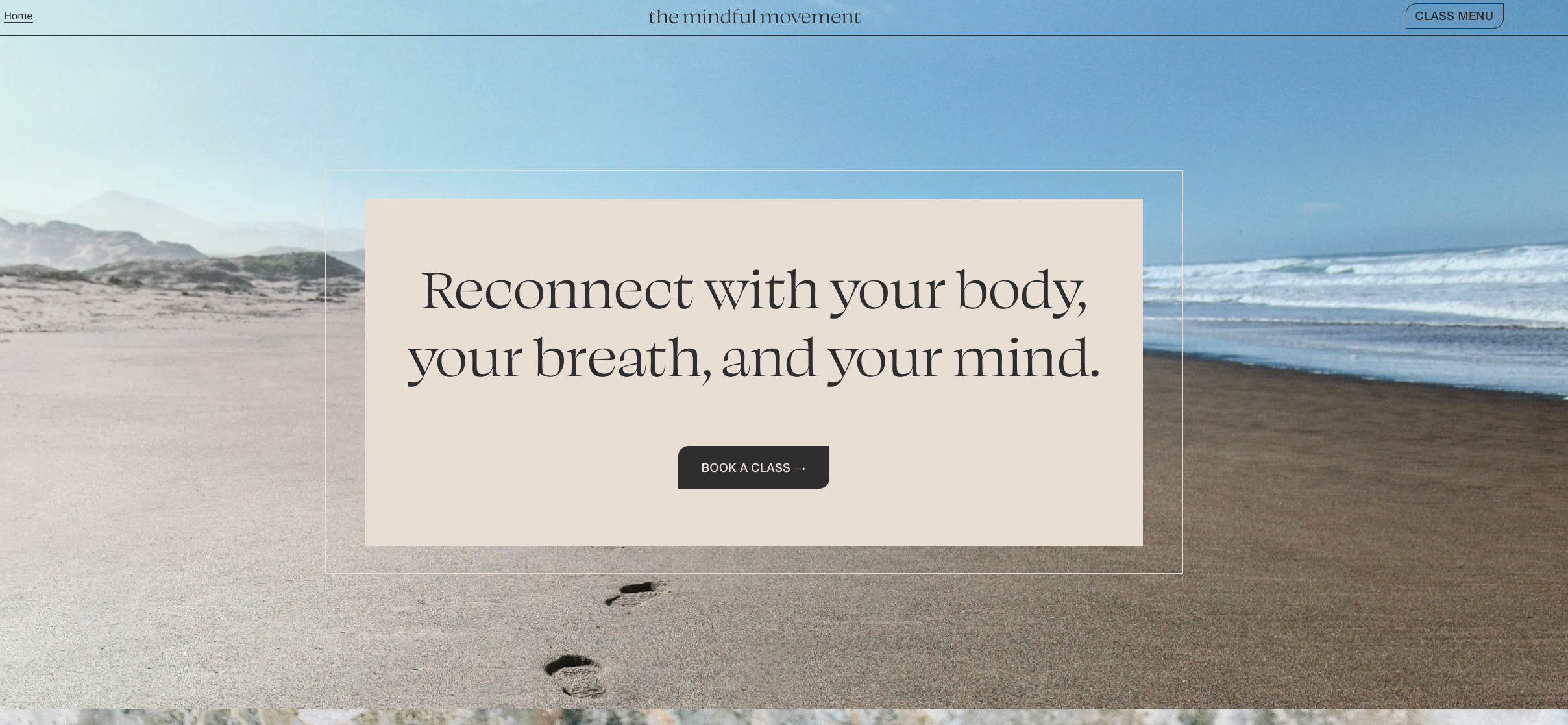
The hero: One question answered before the visitor starts reading — what will I feel here? The image and headline do it together.
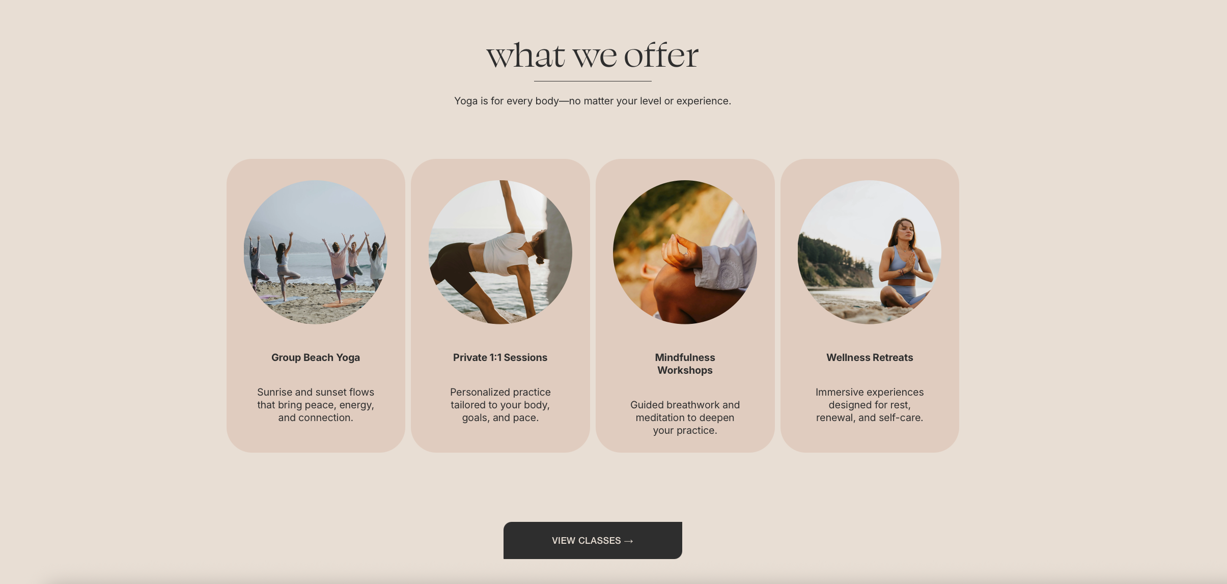
What we offer: Four services, no hierarchy. Every student at every level sees themselves here.
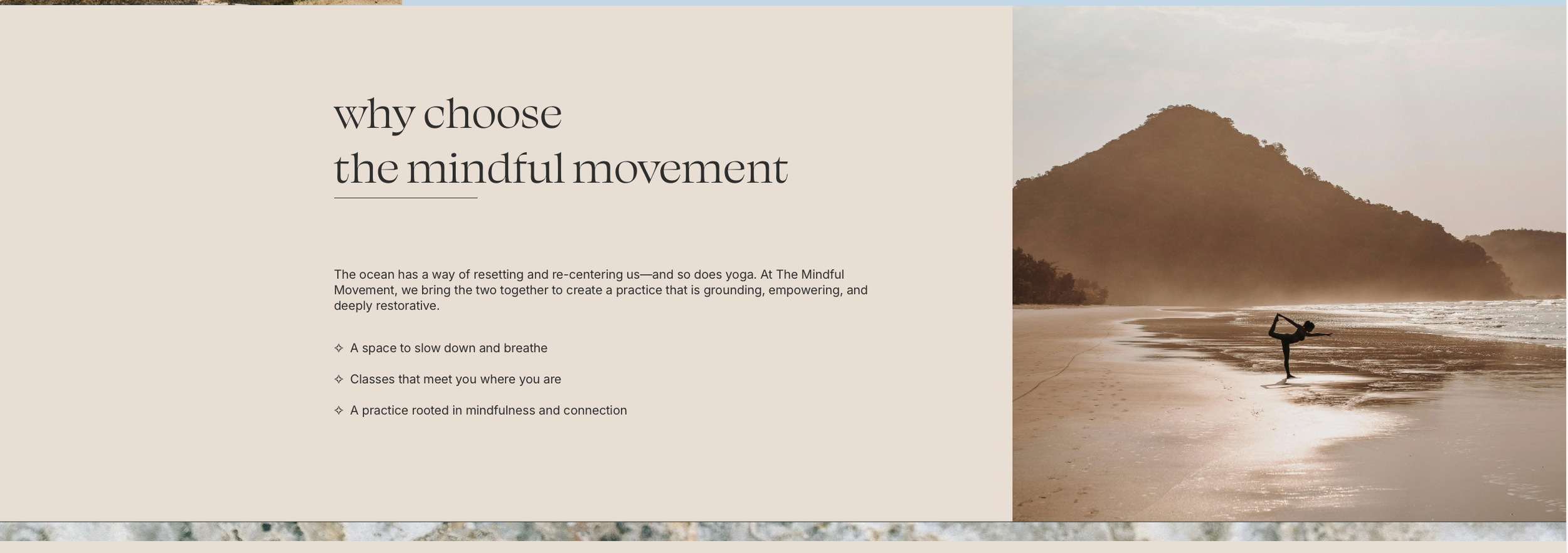
Why choose: The split layout gives visitors a moment to breathe before they decide. The copy reads like an invitation, not a checklist.
If you like this direction, imagine what we could create for your brand.
Your brand deserves a site that is designed specifically to show people not only how great you are, but also make them feel motivated to join you on whatever journey your business is taking. I would love to be the one you trust to make that happen.